

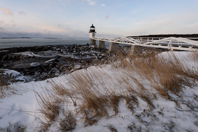
At the top of this post is an image I took last Saturday at Marshall Point. While it was bitterly cold, the rising sun painted the scene with warm tones as sea smoke rose from the waters of Muscongus Bay and clouds moved across an azure sky. The sun caused soft warm tones in the sky, with hints of orange and pink in the clouds. Tall grasses poked out of the snow with light brown tones that contrasted nicely with the blue sky and white of the snow and ice. The image above is my final edit. I adjusted the color and contrast of the image in Photoshop to get the image to most closely resemble not only what I saw with my eyes and what I felt when I came upon the scene.

Below, are five versions of the same file, processed as the camera would have had I used the noted picture style. Notice how flat they are, how lacking in color. Notice how the sky lacks pop and even loses detail. Picture styles are good for general use, but I find they kill more images than they help. Personally, I am not content to settle for images that do not convey my vision. The total time spent post-processing this image for me was less than five minutes. I did not manufacture elements of the scene. I simply brought out the most in the information I captured.

As seems to crop up every now and again, lately, one social media group I am a member of has been debating the merits of the post processing of images versus taking what the camera gives you. I am very firmly planted in the post processing camp. I firmly believe that post processing of images, whether in a darkroom or in digital form, is an integral part of the photographic process. It is the difference between being someone who shot their own film and used their own darkroom to process and print it, and being someone who shot a roll of film and took it to the local one-hour photo lab and settled for the prints they were given.
If you went to the lab, you might get some nice prints, but you’ve given up a huge amount of control over the final look of your image. You might not even realize the amount of creative choices available to you when making prints- things like dodging a shadow to bring out detail here, burning down a highlight area to get better detail in clouds, or even using a detail enhancer on the negative to bring out finer details. It’s the difference between a snapshot and a photograph.

I have seen people call the use of images straight out of the camera (SOOC) as “pure” and “true”, as if those of us who do process our images from RAW files are somehow lying. Now, I have seen my share of photo composites that couldn’t possibly be real, but most times the artist has stated that the image is a composite. I have also seen plenty of overprocessed and overdone images (in my opinion). Perhaps some even feel mine are overprocessed and overdone. That said, I don’t feel the need to stand up and proseletyze in a public setting and state that only one way is correct. If I see an image I don’t like, be it due to composition or exposure or processing, I move on without a word. Photography is a subjective and creative process and others are more than welcome to do as they please with their own images, but to call images “pure” or “truthful” because they were taken straight from a digital camera is simply misguided.

Without getting too technical, today’s digital cameras do just as much processing to an image as I do. The difference is that they don’t know what it is they were looking at when taking the photo. Digital cameras have various presets- called “Picture Styles” on Canon cameras, and “Picture Controls” on Nikons. These picture styles determine how color is reproduced, how shadows and highlights are rendered, and how fine detail is handled. So, who told the cameras how to do this? Most likely, a Japanese software engineer. This guy is today’s version of the photo tech who printed your images at the one-hour photo lab. He determines how your photos will look. Yes, you can choose your picture styles in camera yourself, and you can even customize them. But that picture style still starts where our aforementioned engineer says they do.
When you shoot RAW files, the image you see on the screen is still subject to those picture styles. The camera has to start somewhere, so when I photograph with my Nikon D810, I use the “Camera Flat” picture control. This setting is the least contrasty, meaning I can capture the most amount of highlight and shadow detail without losing any. To judge this, I use my histogram to make sure I’ve properly exposed my image. If you’re unaware of what a histogram is, it’s a graph that shows the distribution of highlights, midtones, and shadows within an image. On the left is shadows, the right is highlights, and midtones are in the middle. The peaks in a histogram simply show how many pixels are at a given tonal level. Using a histogram is akin to using Ansel Adams’ zone system. You should be able to look at the scene and know where in the histogram a particular part of the scene will land, and even plan for that part of the scene to be in a specific section of your histogram.

Adams also used a technique called visualization, meaning he would look at the scene, plot certain sections to fall at certain zones within the zone system, and then know what could be done in the darkroom to get the best final print. I use the histogram in a similar way. By knowing where certain critical areas of my scene fall on the histogram, I know what I can do with those tones in processing, so even if the image on the screen doesn’t look the way I want it to based on the scene I see with my own eyes, I know I can get it. Quite often I’ve heard people complain that they can’t get the image to look in camera the way they saw it with their eyes. This is how you do that. In-camera picture styles are generalizations. They will work well for average scenes but as soon as you challenge them just a bit, you will find they fall short.
One last thought: If you truly want an image straight out of the camera, shoot slide film. Different emulsions have their own characteristics, so you choose the type of film you shoot based on the look you want. Fuji Velvia is contrasty and has saturated colors, and was always a personal favorite of mine. Kodak Ektachrome had more neutral color balance and less contrast. Depending on the emulsion some photographers felt it skewed to the cool side of the color palette. But the bottom line is, when shooting slide film, what you see is what you get.
I’m not here to argue one way is better than another. Photography IS very much an art form, and it’s up to each individual to choose how they fulfill their creative needs. What I will argue is when someone states that one approach is “pure” or “true”. I will again state my opinion that those who argue that side don’t really understand the complete photographic process.
Feel free to comment, but please keep it civil.

wonderful photos and info thanks
LikeLiked by 1 person
Thanks Kelly!
LikeLike
Pingback: Winter Morn at Pemaquid Point – Explorations Through The Lens